 WeAreNewVisionBook a strategy call ↗WeAreNewVisionBook a strategy call ↗
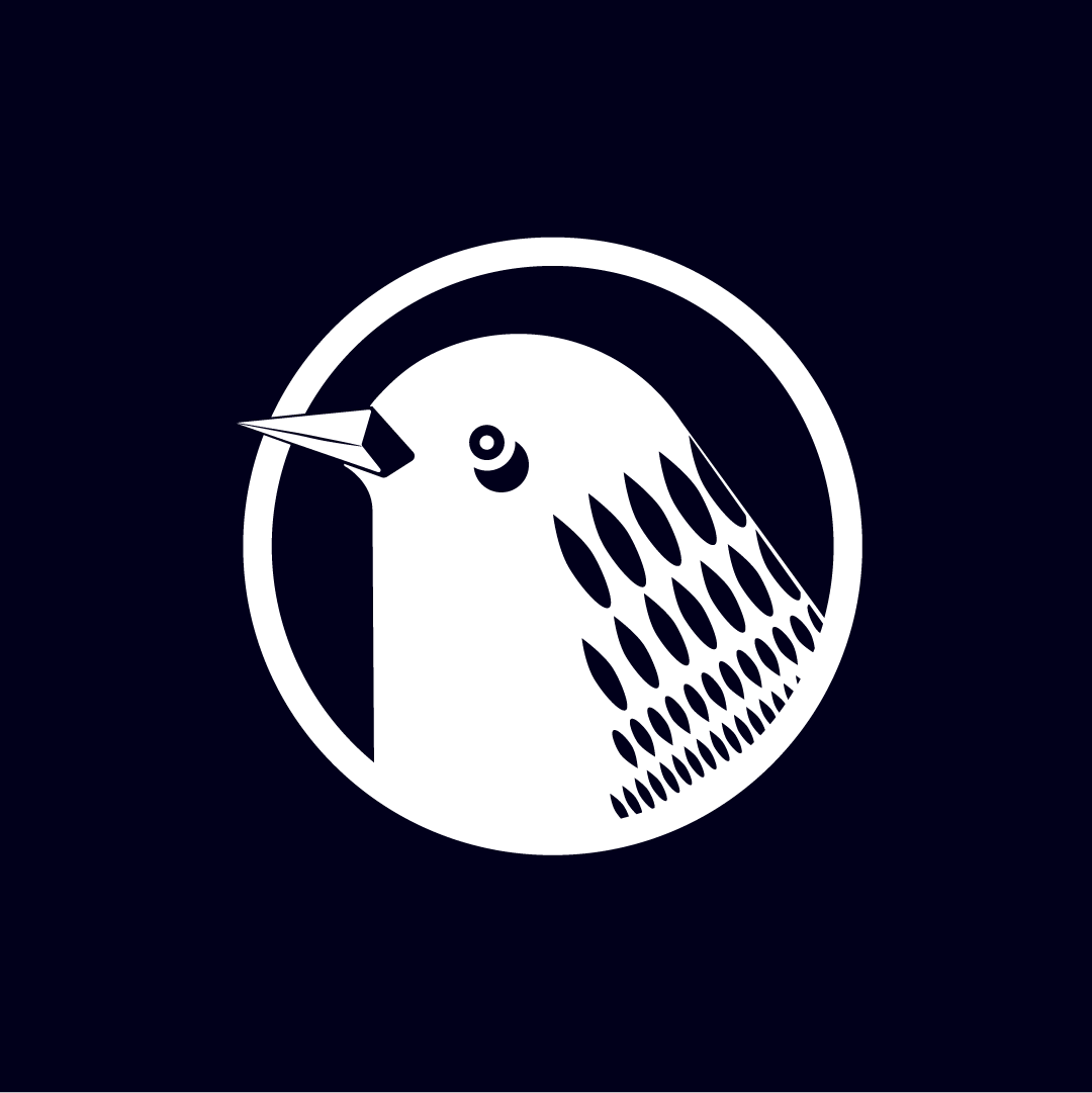
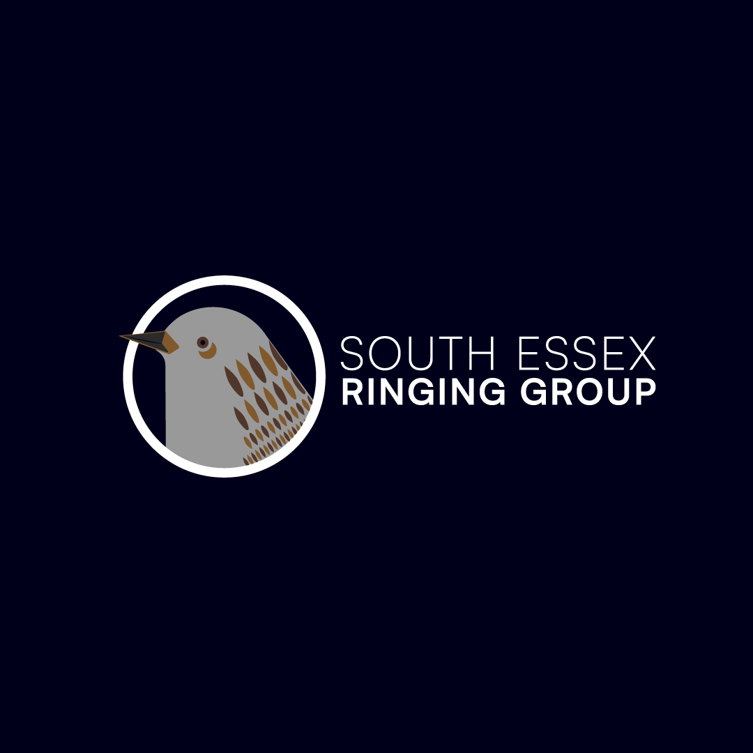
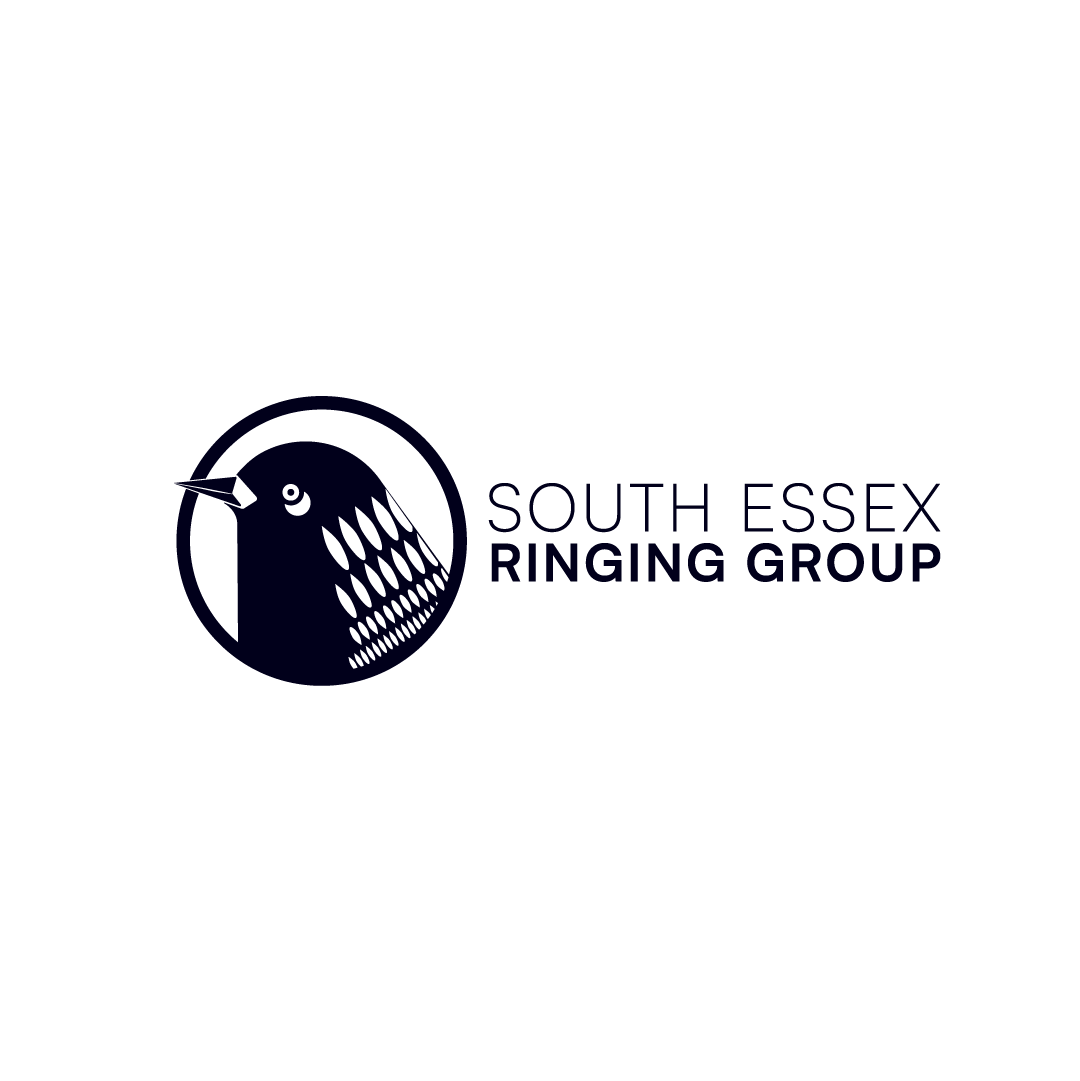
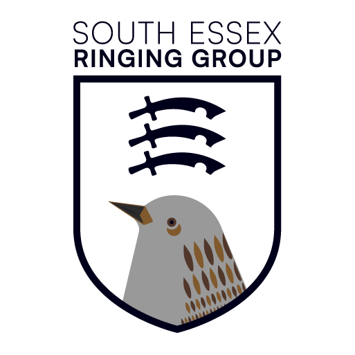
The South Essex Ringing Group, an esteemed ornithological group, approached New Vision to create a fresh and captivating logomark that would embody their organisation's identity.
Visit live site ↗South Essex Ringing Group, an ornithological group, wanted a fresh, captivating logomark to represent its identity. The brief was to feature a Dunnock – a native species that is awkward to make look right – while also capturing a sense of Essex.
We studied the Dunnock’s characteristics closely so the illustration was true to the species, and brought in elements of Essex, including the county’s ‘three sword’ crest, for a sense of place and local pride. We worked collaboratively with the group throughout, communicating clearly and tweaking the design to every request until it was right.
The group has a distinctive logomark, logotype and brand guidelines, in colour and monochrome versions, that reflect its passion for ornithology and its Essex roots. David Wilkinson said he could not have received a better service.
Services we provided
I commissioned a logo for an ornithological group. It was a really awkward brief with a particular species that was so awkward to look right, but the team were so helpful! They communicated well, were responsive and tweaked the image to meet every little need I requested — it was never a problem. I could not have received a better service!